Overview
Wayne County Safe needed a severe face-lift. Their name, logo, messaging, and overall branding did not reflect the important work they do for sexual assault survivors and their families. Kim Hurst needed to get her message to the masses that their organization inspires healing, promotes awareness, and advances social change. It was crucial to make people aware that they are healers, teachers, survivors, and warriors. That they are with you throughout your healing journey.
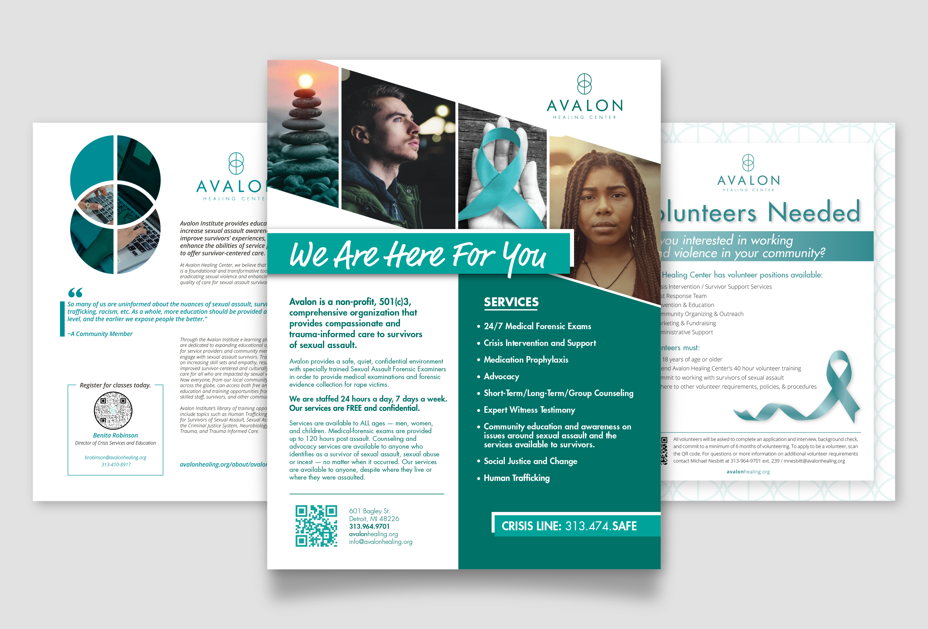
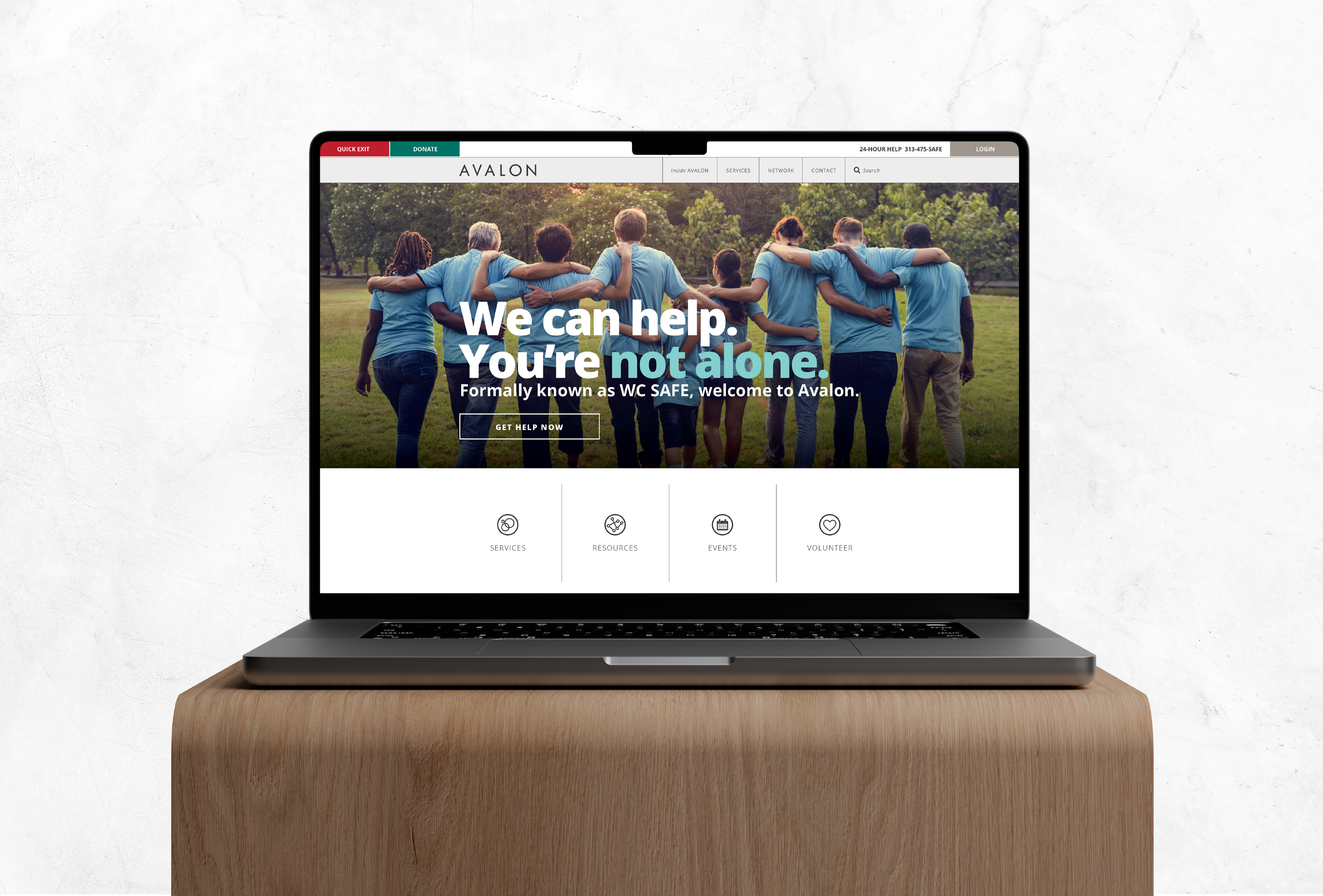
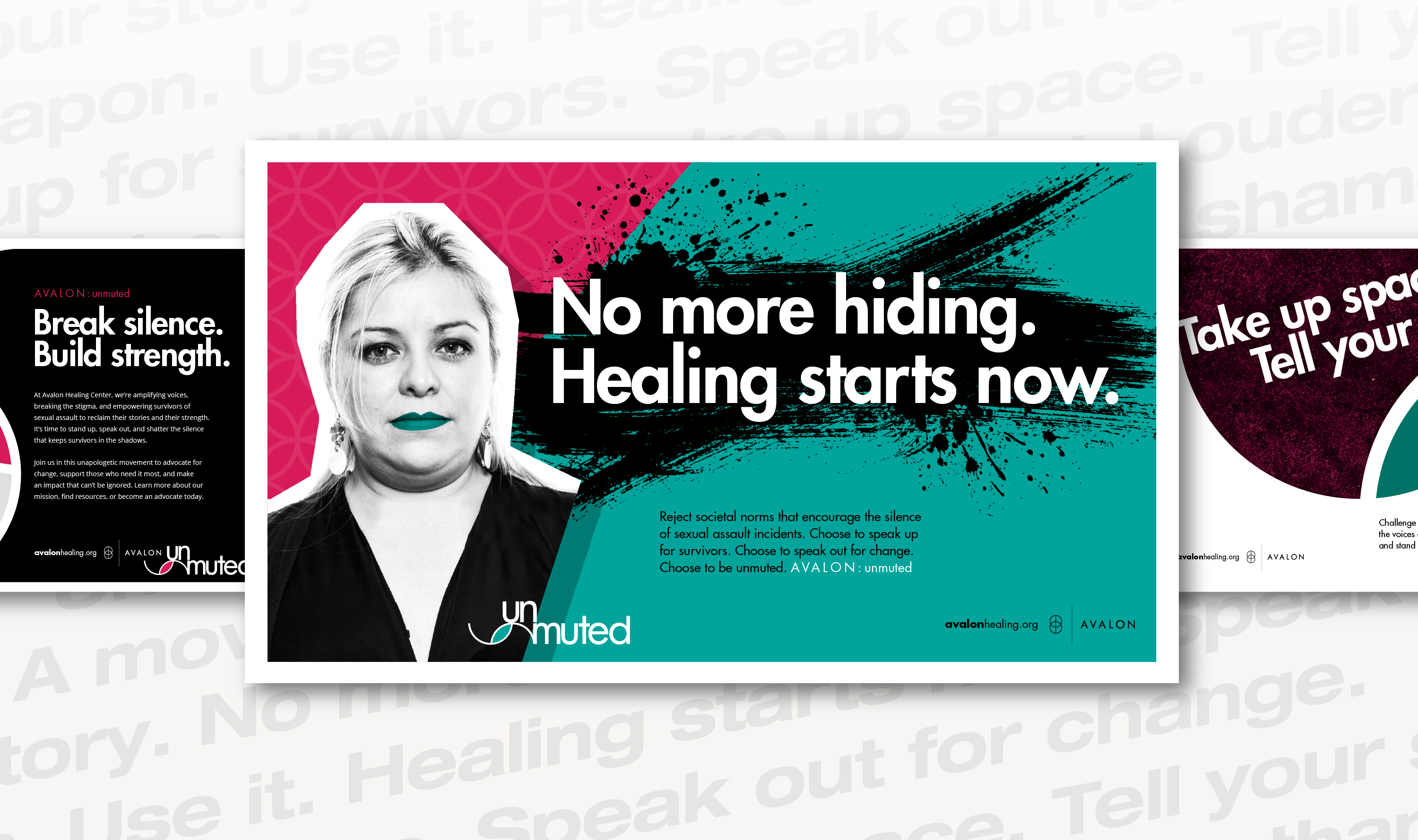
Avalon then needed a new creative campaign that required a full brand identity. Goals for this campaign were to develop a logo and identity to compliment the Avalon branding, create messaging to highlight their ideals, build layouts and assets to use in their marketing, and generate a bold color palette with imagery that will resonate with their audience.
Deliverables
Brand Audit / Naming Ideation / Brand Identity / Brand Architecture / Logo Design / Graphic Design / Messaging / Brand Guide / Corporate Identity / Website / Social Media / Creative Campaign / Animation / Signage / Apparel + Promo / Print
Creatives + Partners
Jennifer Lohman – Brand Build
Capital Imaging – Printing & Signage
Jungle Jane Promotions – Promo Concepts
Andrew Scadden – Graphic Design
Alana Lemke – Graphic Design
Sarah Hopkins – Graphic Design
Matt McDaniel – Creative Thinking
Teddy Jewell – Copywriting
Eleeza Palmer – Animation
Ashley Davis – Web Development
Mitten Films – Photography